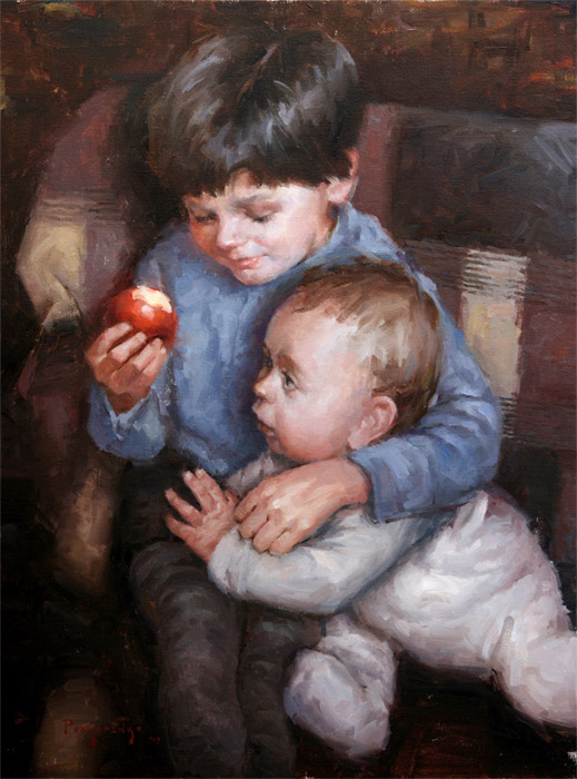
In this tutorial, I’ll share my thoughts at each stage of the painting and explain some of the challenges that came with it.I’m usually not completely satisfied after completing a painting, but this one is different. It had some major challenges, making it that much more satisfying.
Don’t miss the How to Paint from a Black and White Photograph tutorial, where I used this painting as an example.
The Reference
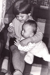
I used a childhood photo of my brother and I from our family photo albums, since that seems to be the best place for reference right now. Unfortunately, a lot of these photos are black and white and were taken with a flash, as is the case with this one.So, I had to invent the colors and move the light source away from the camera (higher and further to the right). I decided that in the painting I’ll go with a more diffused, cool light source – as from a window.
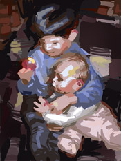
Color Study
I like to work out the colors before I jump into the painting. I did this quick overlay in Photoshop. Simply create a new layer over the photograph, and start putting strokes of color over it. Just make sure not to change the values too much.
I decided that my light source is cool, so I kept that in mind. The colors will shift to a warmer version in the shadows.
The color composition in this case would be a version of the split complementary color scheme. Most of the painting is in the red-purple-blue range with yellow as the accent color. The brightest yellow is in the apple.
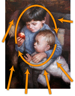
Composition
I think the photo had a strong composition to begin with. I didn’t have to do much with it. There are many entry points that lead the eye to the center. The group of hands lead the eye path around to the apple, then over the head to the right shoulder and back around to the apple. Both of the gazes are focused on the apple making for a very strong center of interest.
The Painting
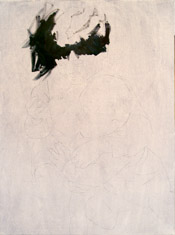
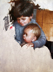
I started on an 18×24 canvas that I toned with a light neutral grey wash.I decided to start at the top and work my way down as I usually do. I like to establish my darks early on because it gives me my full value range and I can judge my values more effectively. It might appear like I just used black, but there’s actually a lot of subtle variations of brown in there. It’s easier to see in the close-up in the next step.
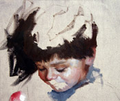
I didn’t do any washes for this painting like I did for the Russian Bazaar. Instead, I went for the direct approach that Morgan Weistling often uses. Richard Schmid explained this approach very well in his book Alla Prima: Everything I know about Painting. One of my favorite books of all time!With this approach you basically try to put the exact color note the first time and leave it. It involves putting tiles of color side by side, like a puzzle.
With the hair I just tried to create an appealing ‘trail’ of highlights. Those strokes can end up looking very repetitive if you don’t watch out. Notice how the color temperature shifts from cool to warm.In the shadow side of the shirt, I added some bounce light from the red cheek. This is important to create unity throughout the painting. The red spot on the bottom left is for the apple. I put it there to help me judge the intensity of the reds in the face.
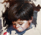
I edited out the pattern on the shirt and made it blue. I’m more concerned with capturing the lighting and its overall mood. I softened the cast shadows from the two heads and extended them out further to coincide with my modified light angle.I began the younger brother’s portrait with the same tiling method.
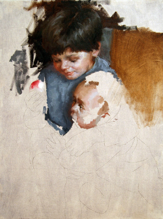
I finished the head and mapped in the folds of the sleeve.At this stage I brought it to school to show Jeff Watts and get his critique. He said that the younger brother (me) looks funny. Something is wrong with the features.
He was right. I messed up the features pretty bad. The eyes are droopy, nose is too short, and upper lip is too long. I decided to take a break from it and didn’t get to it until the end of the painting.
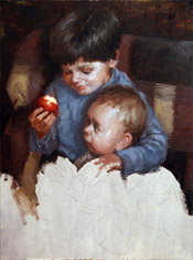
The fabric in the background was fairly simple. In each patch on the fabric I tried to put variations of the color to make it a bit more interesting. I kept the strokes loose and broke up the edges between the patches to give it a ‘rugged’ feel.I wanted to have a fuller apple than in the photograph, so I took some additional photo reference.
The hand was interesting since the bottom part of the fingers would be in shadows with my new light source angle. I’m happy with my decision to move the light source. I think it made for a much more powerful effect with the additional shadows.

I darkened the tights on the older brother to keep the focus up at the portraits. Most of the shadows on the younger brother’s body had to be invented, since the photo is blown out. I tried to simplify it and think of the body as a sphere and the legs as cylinders. How would they be lit by a light source above and to the right…
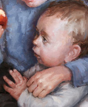
Finally! I fixed the face and painted in the hands, adding a little bit more emphasis on the knuckles.
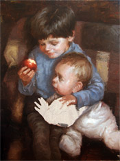
Finished!