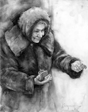
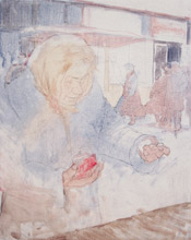
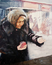
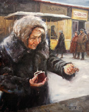
Recently I decided that I wanted to start painting narrative pieces, rather than staying safe with more portraits. This painting is my attempt at capturing a moment of a character’s life. It has a Russian theme which I’ve also been trying to push in my paintings lately. It shows a ‘babushka’ (Russian for grandmother or old lady) making a purchase at a bazaar.
In this tutorial, I’ll share my thoughts at each stage of the painting. I learned a lot during this painting and I’ll share it with you here, so hopefully you can benefit from it too.
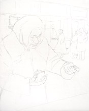
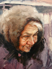
The Study
I like to do a study before any significant painting because I learn a lot from it. I get familiar with the character and the environment. A lot of the shapes stay with me and I feel much more confident moving on to the painting. I try to design the shapes as much as I can and really study all the details of the forms to make them clearer than the actual photograph.
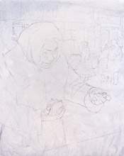
The Washes
I started on a 16×20 Claessens #13 canvas and found the major shapes. At this point I’m only thinking of the big shapes, not edges or values. I don’t want to focus on any details with the drawing because it will get covered by paint and I won’t see any of that information anymore.
I sprayed the drawing with workable fixative to prevent the turpentine from smudging the drawing. Then I began my washes. A wash is simply paint heavily diluted with turpentine to make it transparent. The first wash I started with is a cool grey just to get rid of the white of the canvas and match the value of the canvas to the value of my palette (my palette is a light neutral grey). I let this dry before moving on to the next step.
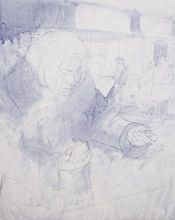
When doing washes, control your values with degrees of transparency rather than actually mixing the proper value. For example, to make a color lighter, add more turpentine rather than adding white. To lighten a dark wash that’s already on the canvas, pick it out with a paper towel.
I started looking for large transition of color in the shapes. I determine what shapes I want to join with the same color and what shapes I want to separate. Also, I want to stay simple and not get carried away with the colors. Here, I chose to use a blue and violet for most of the washes and a warm brown for the area around the head.
I decided to give the jacket a darker purple wash. This is the color that I want to show through in some areas of the shadows. I try to keep my shadows thin, so whatever is underneath will come through to a degree.
The Head
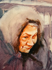
I’ve decided that this painting should have cool light and warm shadows, since it’s a very cold, sunless day. The cool light suggests that she is being lit by the blue sky, rather than the sun. So, I thinly painted in the shadows with Transparent Red Oxide, to hopefully have some of that warmth show through after I paint over it.
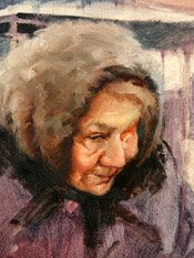
At this point I started using more paint to render the features. I fleshed out the volumes by analyzing the shapes, values, edges and colors. This part requires a deep understanding of light and its effect on forms. I try not to over complicate things, which often happens when focusing too much on the details. Connect and simplify shapes as much as possible and leave only what is essential to show the forms.
I clean up shapes and edges and add subtle things I missed the first time.
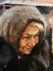
Later on in the painting, I came back to the hood because I felt that the color of the light wasn’t cool enough. The hood seemed to be very monochromatic, so the blue color notes definitely helped.
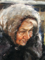
The finished head. I will explain in more detail in the last step…
The Jacket, Hands, and Background
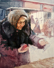
I started the jacket by laying-in the darker shadow areas and then moving on to the lights. The lights and halftones of the jacket are very gray, so I do my best to add some color variation to those grays. I keep in mind that because the light source is cool, as my values get lighter, the colors should get cooler, and as the values get darker the colors get warmer.
I completed the rest of the jacket the same way, then focused on the edge between the jacket and the snow. I softened the edge towards the bottom and let some light from the snow creep on to the jacket. Softening edges and letting objects affect each other will create unity throughout the painting.
When painting the hands I try to think of them as abstract shapes at first and then focus on the anatomical indications afterwards. The knuckles and core shadow areas (the edge of the shadow before it becomes light) are good places to add notes of warm colors.
As I paint the background I try to simplify the shapes to prevent them from competing with the focal point. I lowered the contrast in values by making the shadows a bit lighter. You can see how the shadows of the man on the right are much lighter then the shadows in the foreground. This adds some ‘atmospheric perspective’ giving depth to the painting. The values of the lady walking towards the left are hurting this effect, so you will see me lighten some of those values in the last step.
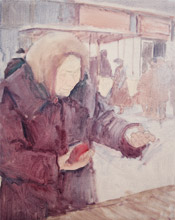
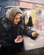
I finished the background and painted the hand that I’ve been avoiding this whole time. At the end of this session I called the painting complete and signed it. But I left somewhat unsatisfied…
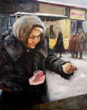
I returned to the painting because there were too many problems I needed to address. Some of the problems I noticed were:
1. The whole painting didn’t feel cold enough.
2. The brushmanship and overall feel was too stiff.
3. The jacket felt too spotty.
4. The color of her wallet/purse felt out of place and didn’t harmonize well with the rest of the painting.
5. Melissa pointed out that the top left corner didn’t make sense to be so dark and she didn’t like how the painting seemed to be divided into a dark half and light half.
6. The Russian word “Bazaar” was spelled wrong at the top.
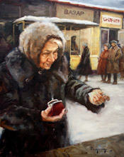
After watching Morgan Weistling’s DVD during breakfast, I got inspired to try the Langnickel brushes again, rather than my traditional Robert Simmons Bristles. I’ve had a lot of trouble with the Langnickels in the past. My paintings always ended up too smooth – a look I’m not too fond of. Smooth can look good if done well, but I haven’t done it well. I’ve heard that with the Langnickels you have to mix more paint. So, this time I mixed huge puddles of paint and I finally saw how great the Langnickles can be. They made me loosen up and let me move the paint around more effectively, solving my stiff brushmanship problem. Bristles usually take off paint rather than moving it around, so I seldom moved the paint around and when I did it was with my fingers.
By adding the warm background on the left, I was able to give the snow on her shoulder a cold glow. The left and right side of the background also feel more connected. I added some cool light to the purse and more on her face. Finally, I gave areas of the painting some noise to suggest snow. Overall, I’m very happy I returned to the piece because the improvements made it significantly better.