Every now and then you might get that commission from someone who wants you to paint their father’s high school photo. Since you can’t rely on the reference for your colors, you’ll have to invent.
I wouldn’t jump into the painting and hope for the best. Something like this needs preparation, especially if it’s a commission.
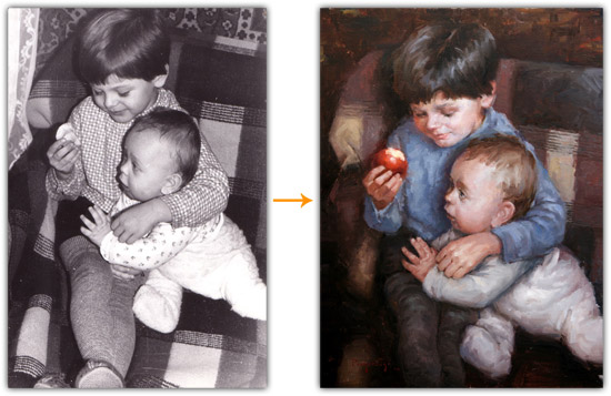
In this tutorial I’ll be using my ‘Brothers’ painting as an example. Lately, I’ve been exploring my family albums for reference and unfortunately, most of the older photos are black and white.
1. Gather Color Reference
Gather as much color reference as you can to help guide you in inventing the colors in your painting. This can be a colored photo with a similar subject. Or it can be a painting by an artist you really admire.
Similar Color Photos
This can be one or a combination of photos. If you’re looking at multiple sources for color ideas make sure that the two photos have similar lighting. You don’t want one to be lit by an overcast sky and another to be lit by a fireplace. This can cause more problems than it solves. Also, keep in mind that the color temperature of the light source plays a big part in the colors on the subject. I’ll talk more about that later.
Stage a ‘Similar’ Scene
Another option is to actually stage a similar scene and take a photo. The subject doesn’t have to be exact, since you’re only concerned with the color harmonies. But the important part about this is to properly light the subject. For example let’s say you get a commission to do a painting of a fair skinned woman. Find a friend that has fair skin and light her with a similar light source. Make sure the light is coming from the same angle and that you decide whether you want a cool light source or warm light source. With so many light bulb options available, you can mimic a fireplace or blue sky – 1000Bulbs.com. Then, paint the original black and white photograph, but borrow the colors from the photo you took.
In my painting, I didn’t use photographs for color reference, but instead, decided that I wanted a similar color feel as some of Morgan Weistling’s paintings…
Other Artist’s Paintings
No, this isn’t stealing… Every color combination has been explored thousands of times by artists at one point or another. You’re simply using their work for inspiration.
You’ll hear me mention Morgan Weistling in many of my posts, since I’m currently very inspired by his work. So, I go to him whenever I need help figuring out my own paintings. I’m also very attracted to the colors he uses and it fits the mood I’m going for. He uses a lot of greys and browns. I’ve always liked using grey in my paintings. You might be different though… Find a role model that shares a similar taste in color as you and study their color compositions and harmonies. Can you find any patterns in the way they select their colors?
2. Color Studies
Overlay in Photoshop
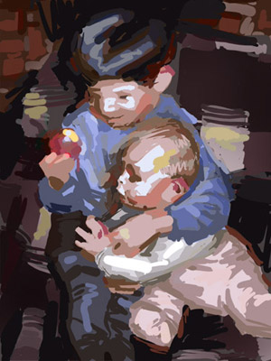
A quick method is to do an overlay in Photoshop. Create a new layer on top of the photo and place large strokes of color over it. This is the method I used for my painting to figure out the color composition.
The color composition in this case would be a version of the split complementary color scheme. Most of the painting is in the red-purple-blue range with yellow as the accent color. The brightest yellow is in the apple.
Thumbnails
If you don’t have experience in Photoshop then the traditional method will be best for you. Paint a small version of the photo, called a thumbnail. The trick with thumbnails is to not get caught up with the details. You’re not trying to create a miniature masterpiece. You’re simply working out the color relationships. Use a brush that you think might be too big for the job.
3. Invent the Colors
Don’t Forget About the Values
Once you actually start your painting, it’s important to remember that you’re inventing the colors not the values. Try to stay true to the values in the photograph, unless you have a good reason to deviate. Mix a color that has the same value as in the photograph.
Reflected Light
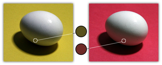
Everything in a painting affects everything around it. For example, look at how the egg reflects the color of the paper next to it. Letting colors ‘bleed’ from object to object unifies the painting. Without this you might get a painting that looks like a collage of objects from different photographs. This mostly applies to the shadows of objects because that is where we see the ‘reflected light’. The color of the light areas will mainly be determined by the color of the light source and the local color of the object. Any reflected light from surrounding objects will be completely overpowered by the main light source.
But it’s interesting that the halftone colors on the eggs appear to be the compliment of the surrounding colors. For example, the egg on the yellow paper appears to have violet halftones, whereas the egg on the red paper appears to have green halftones. Ponder that…
Color Temperature
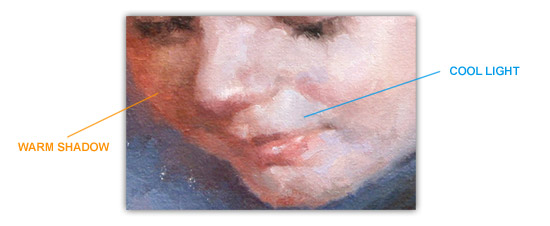
cool light source = warmer shadows
That doesn’t mean that if you have a warm light source, the shadows should be bright blue. It means that the shadows will be a cooler version of the light. The shadows could be blue (such as outdoors during a clear day), but not necessarily.
Broken Color
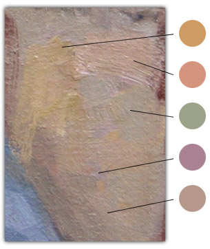
In the areas where you have larger shapes of the same color, consider breaking up the colors. Keep the value the same, but shift the color temperatures of your strokes to make that area more interesting. For example, with skin, you rarely see a large area of the same exact color. Veins, hair, and skin tone variations create notes of blue, green and purple around the red and yellows. Also, consider adding ‘greyer’ or muted versions of the color next to it. This will make the bright colors appear even brighter and create balance.
The example above shows a patch in the cloth from my painting. Notice how many different hues there are of the same value. You can find yellows, reds, greens, violets, blues, and greys. If I oversimplified this area and painted it all in with one color, it would have a flat ‘cartoony’ feel. It would lose its vibrancy.
* * *
After a few years of experience, you should start noticing patterns of the way light affects forms. You’ll begin building a library of ‘rules’ that you will intuitively reference whenever you need to invent color. Experience plays a big role in realistic color invention, especially, experience in painting from life. Get out of the studio on a regular basis. Don’t underestimate those live model workshops and plein air painting.