I am currently working on:
Proko – Platform for artists to improve their skills and connect with a community of like minded peers and talented mentors. We also help produce and monetize instructional videos for art instructors that want to start teaching online.
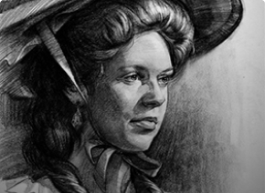
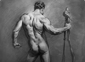
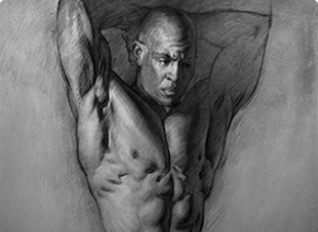
My Courses – I create entertaining and informative video tutorials for artists. I have 4 courses available for artists learning to draw: Drawing Basics, Portrait, Figure and Anatomy.
My Artwork – Check out the large gallery here on the site, or follow me on Instagram for all the updates.