
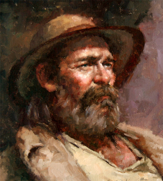
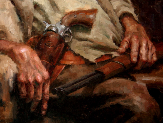
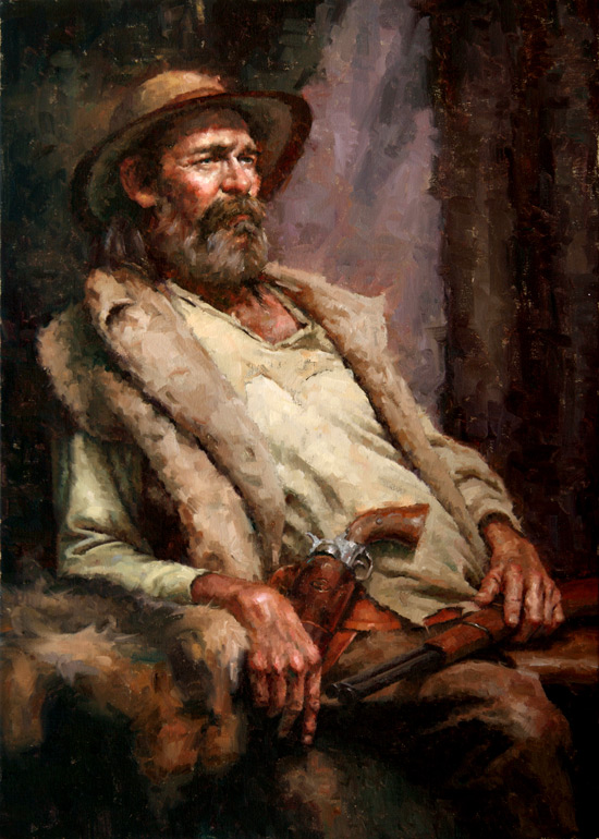
Finished my entry to OPA this weekend. I submitted “Sunset at Pine Tree Forest” and this painting of a mountain man.
For this painting, I knew that the powerful value contrast was very important. I wanted to keep the colors muted (staying in the grey and brown range) and exaggerate the values. So I did a value comp in Photoshop.
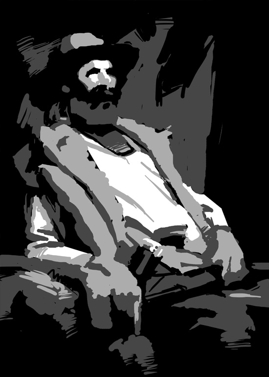
Working Out the Values with a Comp
This time I simplifying the values to only 4. Sometimes I will go to 5 values organizing it like this:
1. Shadow - Reflected Light
2. Shadow - Core Shadow and Dark Accents
3. Light - Dark Halftone
4. Light - Light Halftone
5. Light - Highlight
If you’re not familiar with some of the terminology, reference my tutorial on Direct Light.
So, with this value comp I decided to combine the highlight and light halftone values to get a simplified 4-value study.
Detailed Close-ups


Email to a Friend
Get Email Updates: Don't Miss New Tutorials


9 Comments:
WOW!!! Very awesome man! Love the eyes!
THANKS clementine!
Great one, Stan! So, is this new “western” genre the direction you’re looking to move into now?
Not doing it intentionally, but I do enjoy it. After I go to my Russia/Ukraine trip this summer, I’ll probably be doing a lot of farm life paintings and Ukrainian/Russian landscapes.
…Post?
I like it, did you paint this from life or reference?
I painted a study for this from life and then did this one using a photo and my study.
Отлично написано! Очень интересно было посмотреть на технику исполнения. Понравились многие портреты. Здорово работаете свет-тень. Отлично в контрасте. Не часто можно увидеть предметную живопись такого качества на иностранных сайтах. Ваша школа похожа с прекрасной живописью Jeffrey R. Watts, чей сайт приведен в Prokofolio
Ivan, Thank you for the compliments!
There are many non-russian artists of this quality and many that are better. Maybe you are just not familiar with many foreign artists?
Yes, Jeff Watts is my instructor!