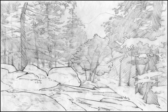
The Shape Design Study
At first glance, the photo reference is overwhelming. There’s a lot of stuff going on and all the trees blend together. So, I felt it was important for me to study the shapes in more detail and redesign some for a simpler and more powerful effect. And just to have more confidence knowing where the major tree masses are once I go to paint the final piece.
The Rocks
I started with the rocks. I knew that I wanted to keep their triangular nature and even exaggerate it. So, I kept the right end flat and pointed the triangular shapes toward the rocks on the left of the composition. I also lined up the right ends of the rocks to be parallel to the distant path in the background. I injected some straights in there focusing on separating the top planes from the side planes.
The Trees
Overall I like the shapes of the trees. The branches seem to mainly point down towards the center of the composition. I want t make sure I don’t lose that. However, I didn’t like how the two thickest trees are at the very edges. So, I moved the left tree to the right and will move the sun to right right as well.
The Mountain
I moved the mountain to the left for two reasons. First, I didn’t like how the edge of the mountain lined up perfectly with the top branch of the tree on the right. I felt like they needed to be separated. Second, the peak of the mountain felt to far to the right in the composition. So, I moved it closer to center, which provides for a better shape in the window through the trees.
Next – Part 4: Gouache Color Study