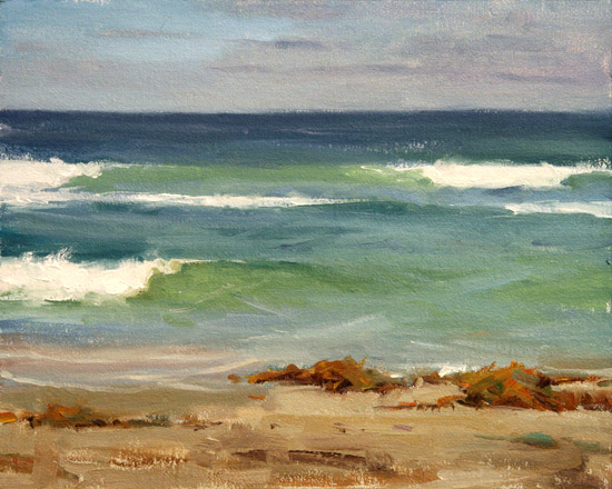
It’s weird that I’ve lived in San Diego for 9 years and have never painted the waves. This was one of the most challenging plein air paintings I’ve done. You really only have about a second to look at a wave until it’s gone. I tried to take a ‘snapshot’ in my mind of a different part of the wave, every time one came by. I also focused on a different element every time too. What are the values, edges, colors, shapes?
The composition and placement of the waves is completely up to me. I watched for a while until an arrangement I liked came by. Then I memorized it and quickly drew the large shapes. Looking at the finished piece a few days later, I don’t like the composition I chose. The two biggest white shapes are on the left edge of the canvas. Even though it’s balanced by the seaweed and wave on the right, something feels unsettling. There’s definitely room for improvement.
I’ll make an effort to paint more of these. It’s a really great exercise in design and analyzing.